Understand Sign-In Widget color customization
The Sign-In Widget determines its colors based on your brand's Primary color and its adherence to WCAG 1.4.3 accessibility standards. For information about creating and customizing a brand, see Branding.
Button state colors in the Sign-In Widget (third generation)
The Okta Sign-In Widget (third generation) changes the button color based on user interactions like hover and click. Okta generates a color palette using variations of your Primary color for these different button states.
For example, if you select #638015 as your Primary color, Okta generates the following palette:
-
Primary color: #638015, Token name: PalettePrimaryMain

-
Button hover: #464F2E, Token name: PalettePrimaryDark

-
Button click: #343A22, Token name: PalettePrimaryDarker

The hex value of your chosen Primary color can be too dark or too light. If so, there aren't enough shades in the palette to produce colors for the different button states. In this case, the SIW produces an adjusted primary color to ensure that a full palette can be generated. The adjusted primary color is what is displayed on the rendered SIW button.
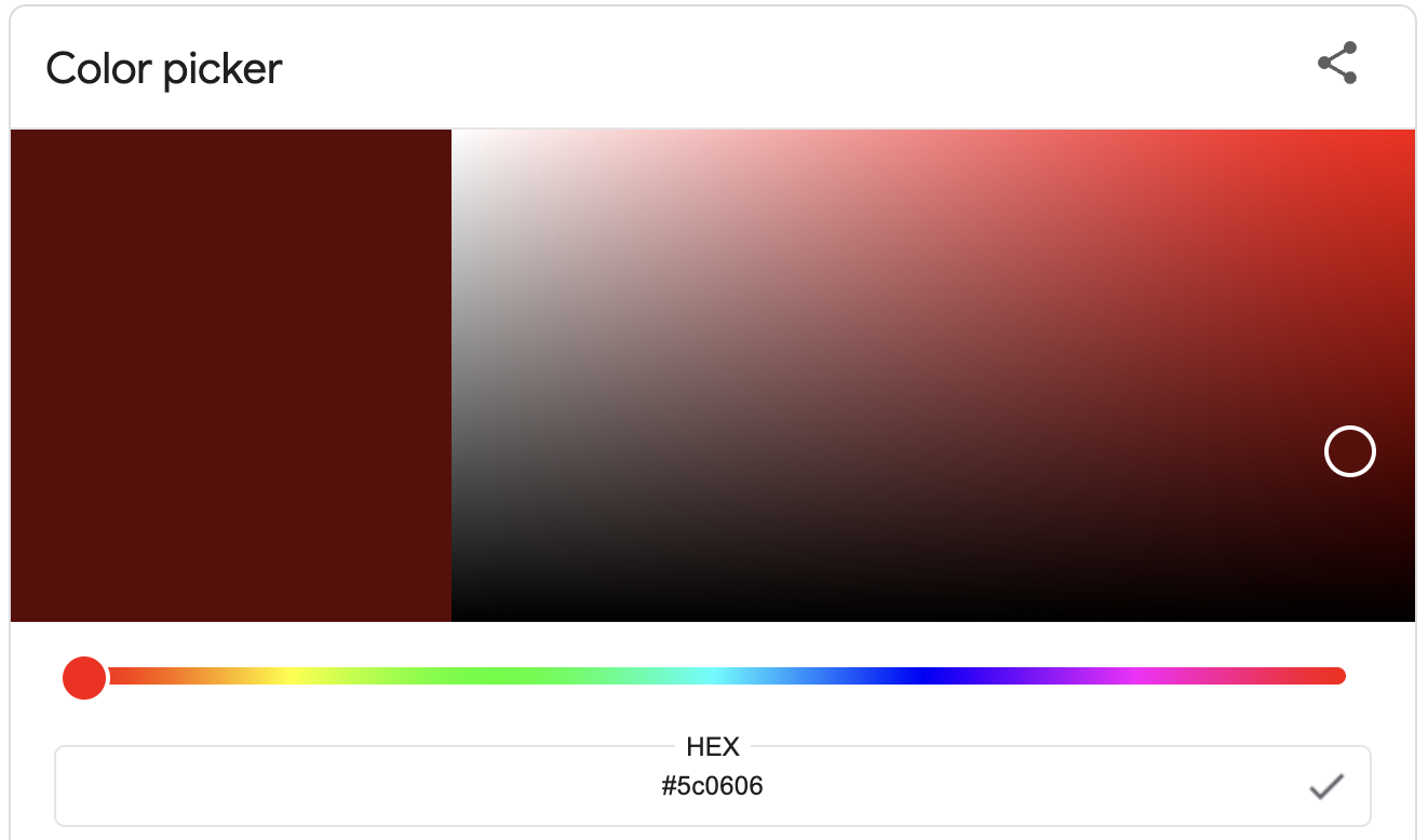
In the following image, the Primary color is set to #5c0606. This color is too dark to generate a palette, so a lighter adjusted primary color is chosen: #9C6969. A palette can be generated using this adjusted primary color.
- Primary color: #5C0606
-
Adjusted primary color: #9C6969, Token name: PalettePrimaryMain

-
Button hover: #7B3535, Token name: PalettePrimaryDark

-
Button click: #6A1B1B, Token name: PalettePrimaryDarker

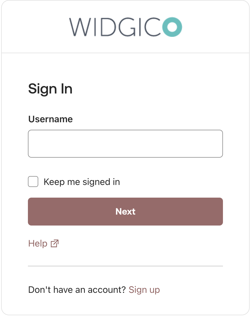
Button text color and accessibility compliance in the Sign-In Widget
The Sign-In Widget enforces WCAG 1.4.3 accessibility compliance, meaning the button text color must maintain a minimum contrast ratio of 4.5:1 against the button's background. Both generations of the Sign-In Widget ensure that text color meets accessibility standards. The second generation changes the button text to black if white text lacks sufficient contrast. The third generation adjusts the Primary color to find a suitable text contrast.
Sign-In Widget (third generation) button text color
The Sign-In Widget (third generation) button text is always white. Sometimes, the chosen Primary color is too dark or too light to provide enough contrast against white button text. If this happens, the Sign-In Widget (third generation) changes the Primary color to an adjusted primary color that meets the minimum 4.5:1 contrast ratio.
Example: If you choose #96C21F as your Primary color, the contrast ratio against white text (#FFFFFF) is 2.09:1 (<4.5:1). The Sign-In Widget (third-generation) adjusts the Primary color to #638015 to ensure a contrast ratio of 4.53:1 (>4.5:1) for the button text.
Sign-In Widget (second generation) button text color
The Sign-In Widget (second generation) button text can be either white or black. By default, the SIW uses white text. Sometimes the chosen Primary color results in a contrast ratio against white text that's less than 4.5:1. When this happens, the SIW changes the Primary contrast color (text color) to black to ensure accessibility compliance.
Example: If you choose #6B8A16 as your Primary color, its contrast ratio against white (#FFFFFF) is 3.98:1 (<4.5:1). The Sign-In Widget (second generation) therefore changes the primary contrast color to black (#000000) to achieve a contrast ratio of 5.27:1 (>4.5:1).